


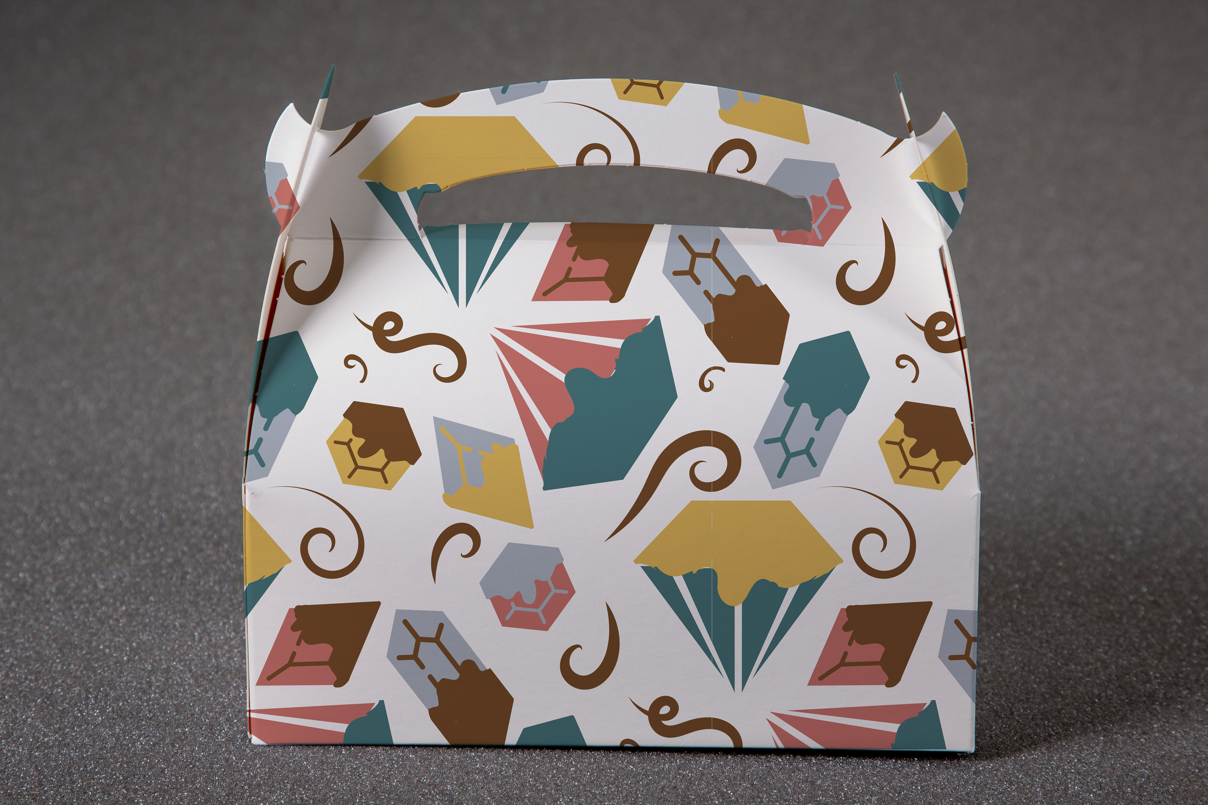


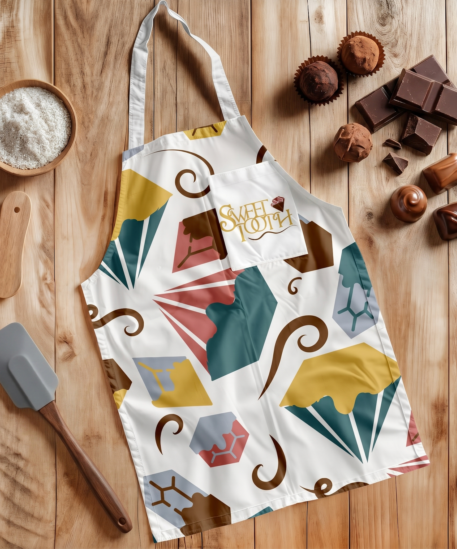


This project started with building a brand that could function as a system, not just a single design. I developed the “Daily Practice” identity using a consistent set of typography, color, and layout rules that could adapt across different formats. Applying it to packaging is where everything came together, turning the identity into something tangible and functional. What I enjoy most about this piece is seeing how a structured system creates consistency across every touchpoint.