VOCABULARY CARD APP PROTOTYPE
SUMMARY
For this project, we created a set of digital flashcards covering HTML and CSS terms. These flashcards would be part of an app prototype, and we emphasized developing a cohesive design system. Within this system, we aimed to demonstrate strong typography, color contrast, and well-structured content.
GOALS
My personal goal for this project was to gain more experience with Figma and app prototyping. While I have some prior knowledge from earlier projects, I hoped to explore more of Figma’s capabilities. I also wanted to deepen my understanding of what makes a strong design system and expand my knowledge of UI/UX design principles.
FLASHCARD DESIGN:
LO-FI WIREFRAME
For my initial sketches, I experimented with designs inspired by the HTML and CSS logos as well as other computer-related themes. At one point, I even considered a typewriter-inspired design! Some sketches were unclear, but that’s simply part of the creative process. Ultimately, I decided to lean into the essence of HTML and CSS, designing around the concept of coding languages.
NAVIGATION MAP 
When creating my navigation map, I focused on organizing the user experience efficiently. I wanted the navigation to be intuitive, ensuring smooth forward and backward transitions. I also grouped HTML-related terms and CSS terms separately while making sure all paths led back to the home screen.
MED-FI WIREFRAME AND PROPOSED DESIGN SYSTEM
At this point, I shifted to Figma to gain proficiency with the software. I began by converting my low-fidelity sketches into digital designs. After establishing a strong base, I iterated on these designs, integrating new concepts that surfaced throughout the process. Certain designs focused on logos, while others delved into themes inspired by the internal mechanisms of a computer.
DESIGN SYSTEM
For my final design choice, I developed a design system based on this concept. I selected two complementary typefaces that align with the theme and established a cohesive color palette. Additionally, I created arrows, a home button, and custom line elements to enhance the app's visual appeal identity.
FINAL WORK
The final design features a green color scheme with enhanced black accents and typography. I retained most elements from my original design system but modified the accent layouts on each flashcard. Additionally, I created GIFs for each card, incorporating a flashing downward arrow to encourage users to scroll down for definitions.
APP PROTOTYPE BUILD:
DESIGN
Building the design was a smooth process. I copied and pasted elements with minor modifications for each screen. To create visual differentiation, I adjusted accent elements and extended screens based on the length of definitions. During this phase, I also designed an interactive home button that lights up when hovered over over.
PROTOTYPE
For the prototype, I created a component that allowed each home button to automatically link back to the home screen, eliminating the need to wire them manually. I then connected all arrow buttons to their respective screens, ensuring consistent transitions throughout the system app.
FINAL BUILD
Once the app was complete, I created a mockup using several screen designs. I then combined these screens in Photoshop, overlaying them onto a phone mockup. After finalizing the visuals, I integrated the mockup into my project presentation.
KNOWLEDGE GAINED
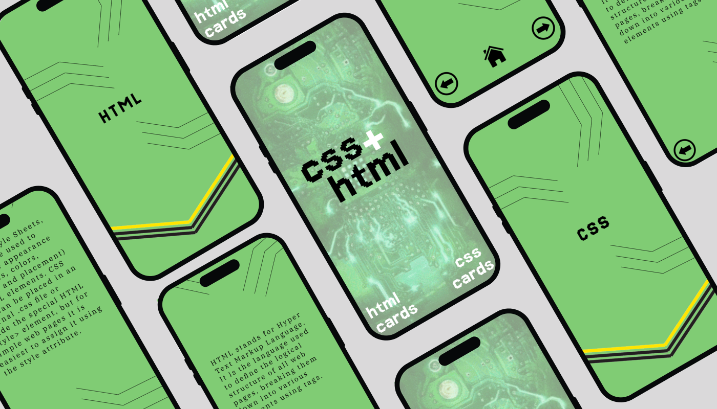
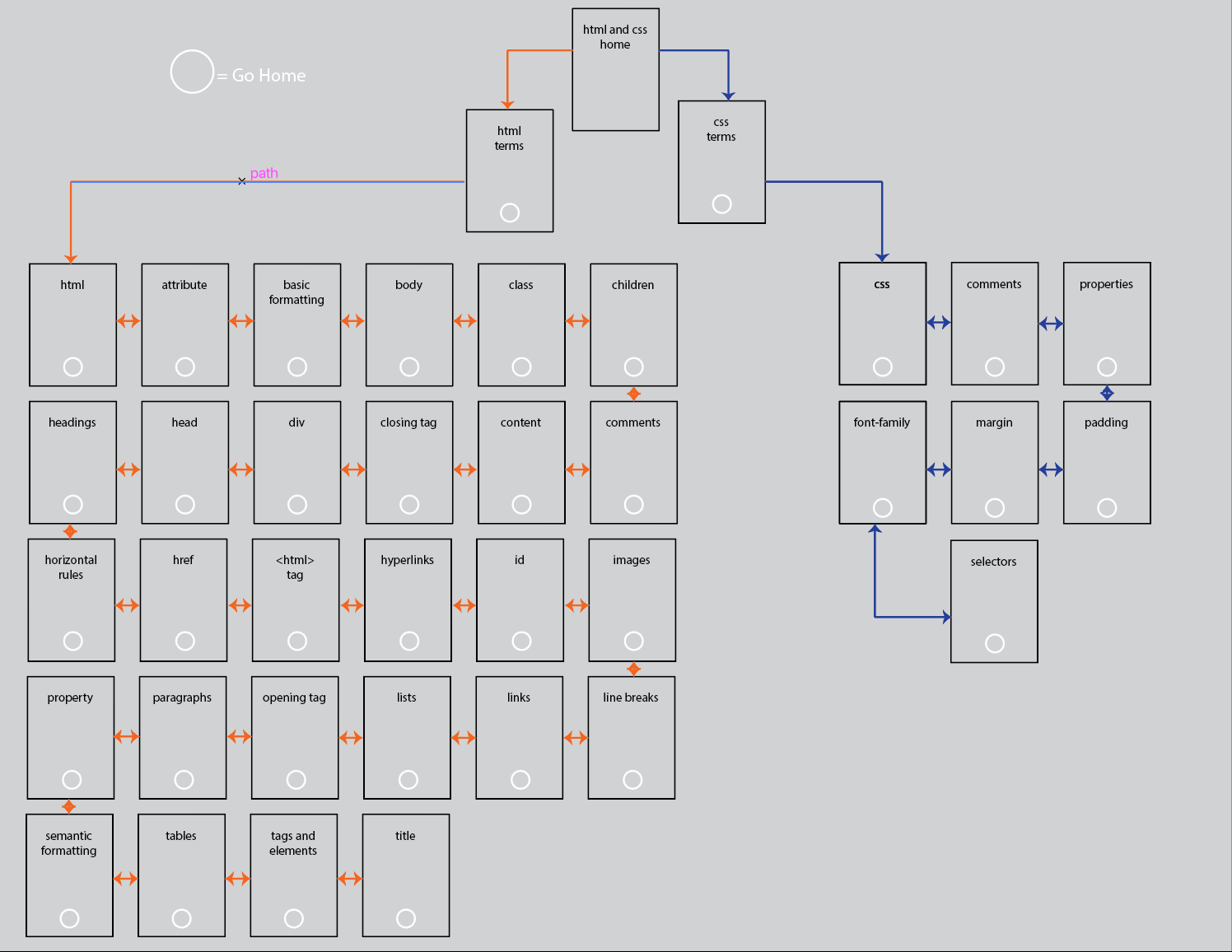
Through this project, I gained a wealth of experience in Figma—not only in designing an app but also in creating components and interactive elements. I also learned how to build mockups within Figma after working with Photoshop images, which was a new technique for me. Additionally, I developed a deeper appreciation for the complexities of UI/UX design, reinforcing my determination to continue learning in this field.

You may also like

Back to Top